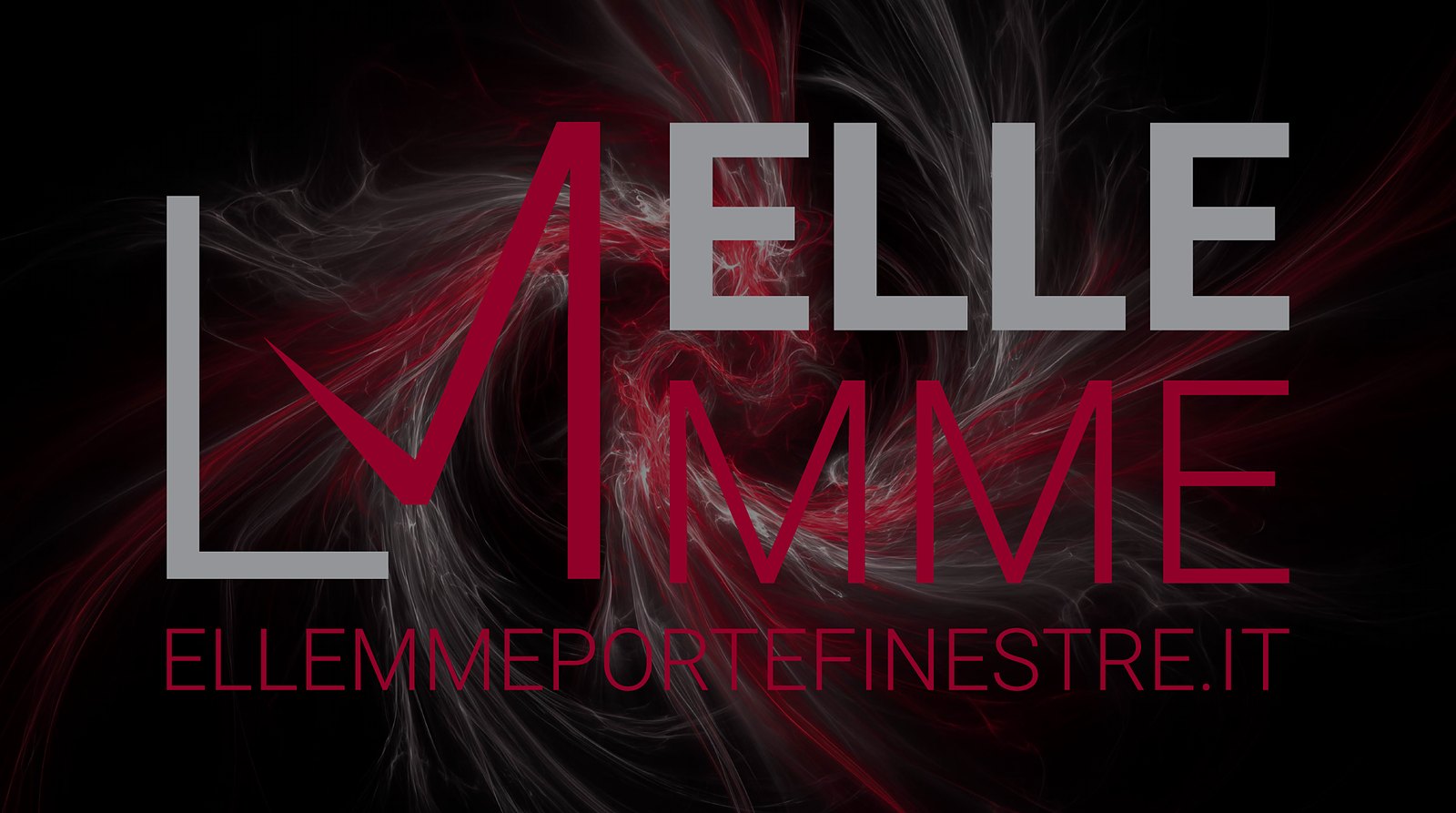
Ellemme
An L, an M and a tick.
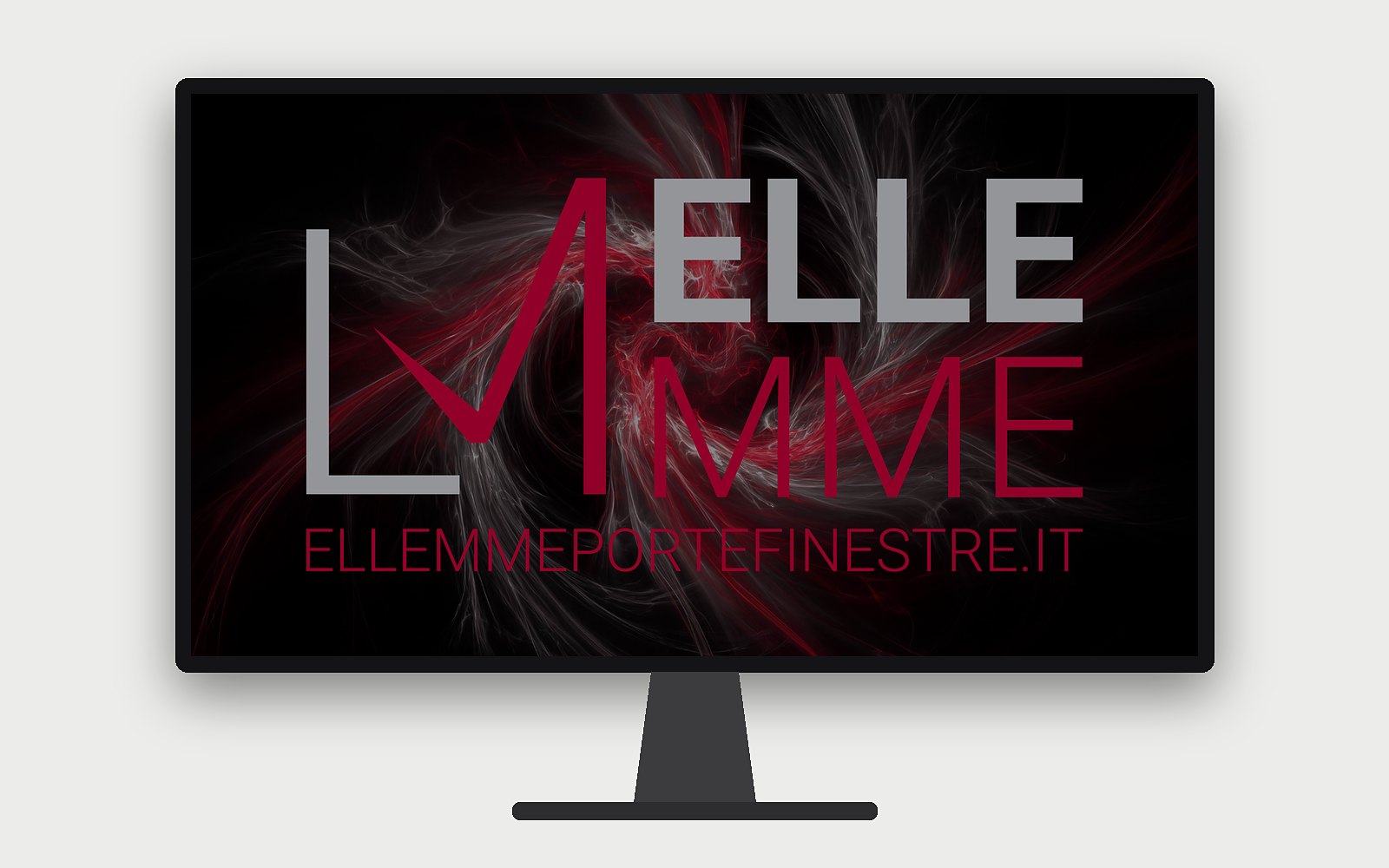
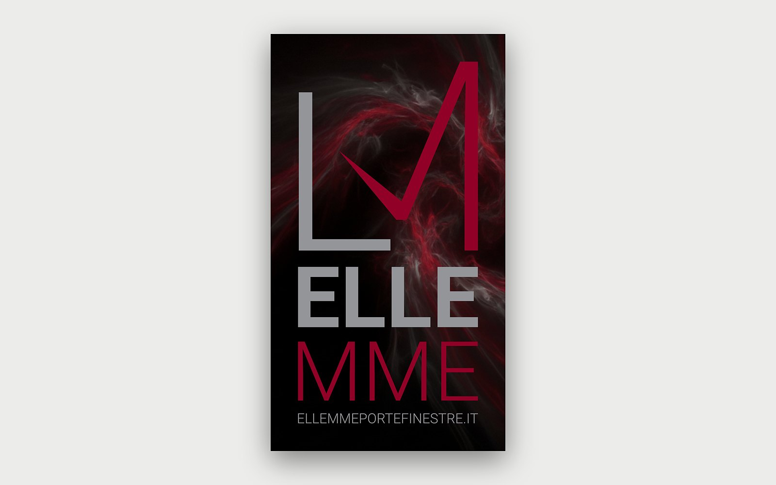
Ellemme: logo restyling and corporate identity for a windows and doors company in Magenta (Milan). Business cards, monitor background and shop window graphic by Unlead.
- Client
- Ellemme
- Based in
- Magenta (MI)
- Sector
- Windows and doors
The project
Logo restyling and corporate identity for a windows and doors company in Magenta: from business card to shop window
The client
Ellemme sells and installs windows, security doors, roller shutters, security shutters, grilles and insect screens, with a showroom in Magenta. It also designs and installs window joints to the CasaClima protocol.
The brief
A restyling of the mark and the tools to use it every day: on business cards, on the office screens and in the shop window.
The approach
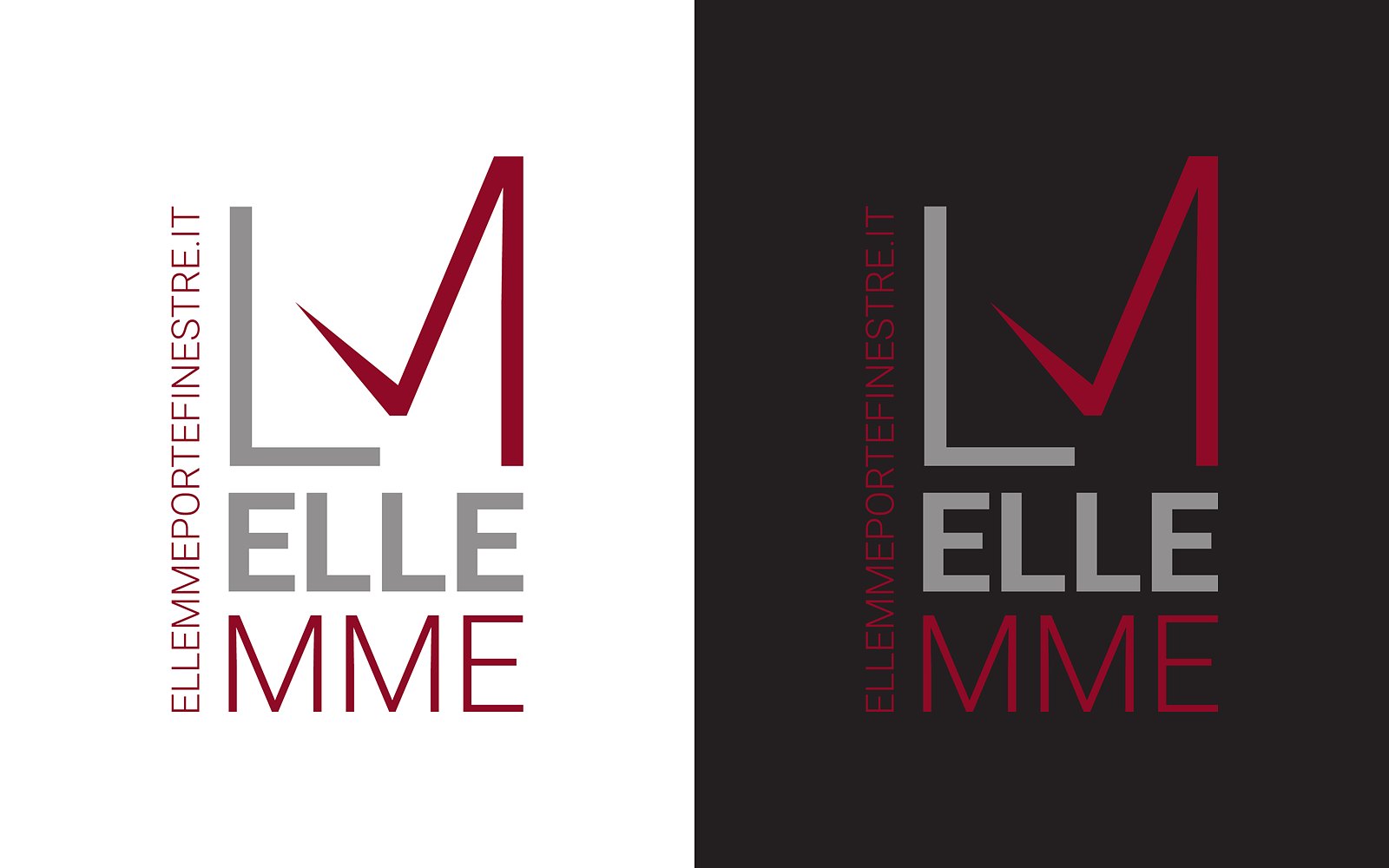
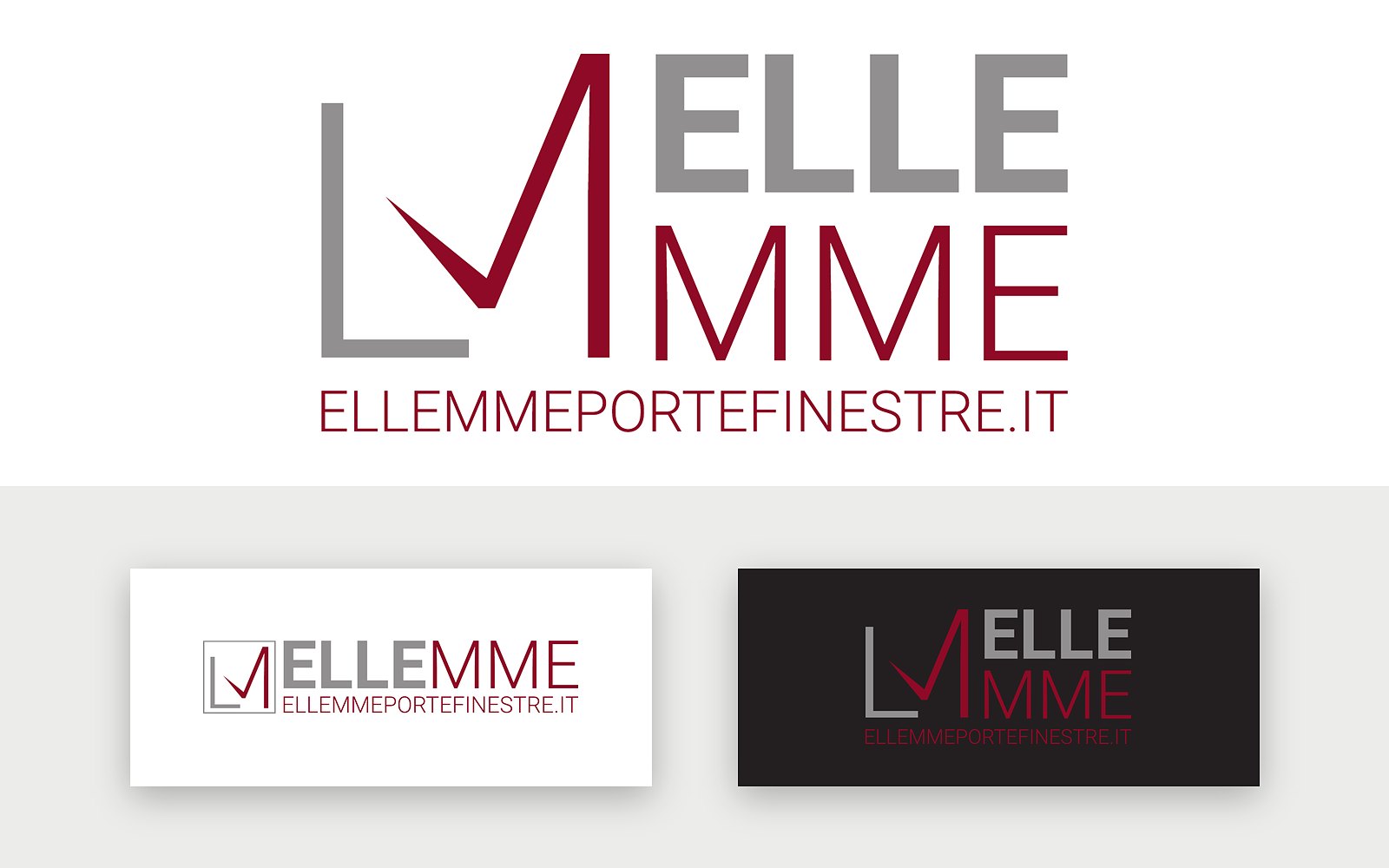
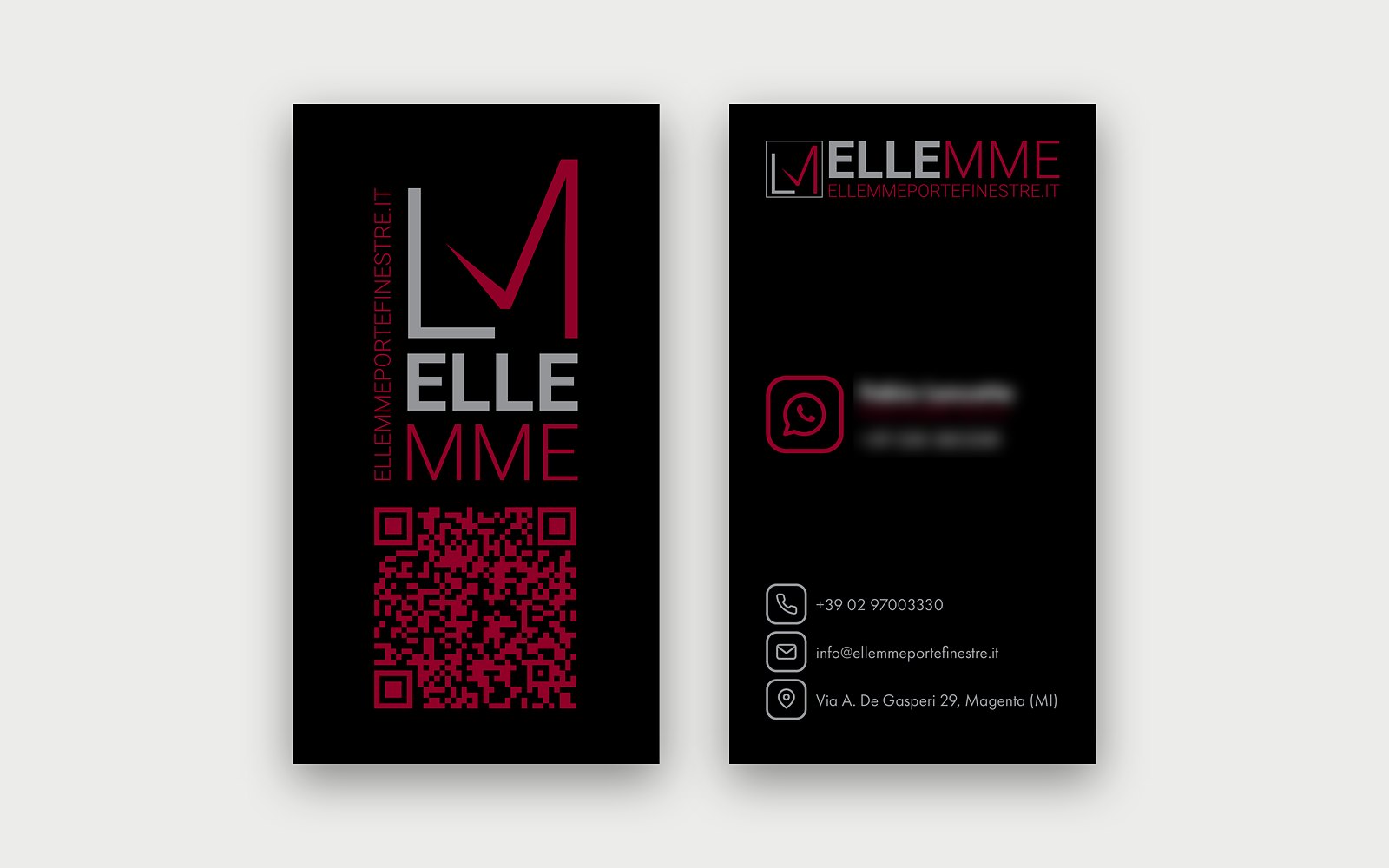
We redesigned the logo: a grey L and a burgundy M meeting in a tick, ELLE in grey and MME in burgundy, with the domain as a signature. The mark comes in vertical, horizontal and compact versions, in positive and negative. From there, the corporate identity: vertical business cards on black, with a QR code leading to the website, the desktop background for the office monitors and the shop window graphic, on the same black ground crossed by red and grey filaments.
Project images
The results.
- +A more recognisable markplus a more recognisable mark
- +The same mark from business card to shop windowplus the same mark from business card to shop window
- +A version for every mediumplus a version for every medium
Our process, on every project
- 01AnalysisThe market, the business and who will use the result: we understand where we are starting from.
- 02FeasibilityNeeds, costs and benefits compared, to choose the right solution.
- 03DesignThe solution designed in detail and agreed before it is produced.
- 04ProductionGraphics, photos, video or code, checked against the agreed requirements.
- 05LaunchGo-live or delivery, with training for those who will use it.
- 06ManagementSupport, measurement of results and ongoing improvements.